Friday, 22 November 2019

Monday, 18 November 2019
Friday, 15 November 2019
Newspaper language conventions
Types of newspapers
Mid Market tabloid
Soft News- Celebrity gossip, sport, entertainment, fashion, art and culture and human interest.
Hard News- Politics, business and the economy, industry and technology, science, war and conflict, health and education.
Broadsheets
- Broadsheets (quality tabloids)- The Guardian, The Times, The daily Telegraph, The I, The Financial Times.
- Tabloid- The sun, Daily star
- Mid Market Newspaper- Daily mail, Daily Express
- Local Newspaper- The Essex Chronicle
- Freesheets- Metro
- Sunday Newspaper- The Observer, Sunday Times, Mail on Sunday
Mid Market tabloid
- Typography- Dramatic headlines in large bold uppercase font (like a tabloid). Sometimes called a black top.
- Traditional British news values- Daily mail with the royal family.
- Headlines can explore moral panic- NHS, knife crime, weather.
- Uses high impact tabloid style headlines but more text than tabloid.
- Direct informal mood of address.
- Use of pronouns to implied shared beliefs.
- Meant to be more subjective than objective.
- Cross between broadsheet and tabloid, soft and hard news.
Soft News- Celebrity gossip, sport, entertainment, fashion, art and culture and human interest.
Hard News- Politics, business and the economy, industry and technology, science, war and conflict, health and education.
Broadsheets
- Text to image ratio is much higher, more in depth.
- Sophisticated, formal language
- Objective / balanced news
- Largely hard news
- Larger format, smaller typography
- Main story, small letters, more words
Serif- Simple, straight lines typography.
Sans Serif- More complicated typography, less straight lines.
Newspapers front cover
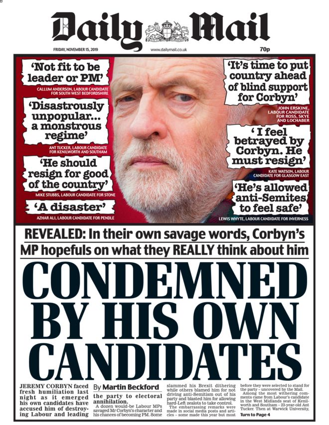
Mid Market- Daily Mail
Broadsheet- The Guardian
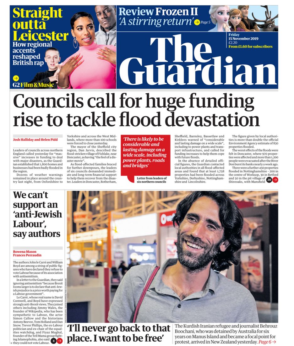 The Guardian uses formal language and no slang such as "councils call for huge funding rise to tackle flood devastation." This is so it appeals to the upper class and people from the A-B demographic. The Guardian has a largely hard news agenda as the front page focuses on the election, flooding and councils. However, there is a bit of soft news at the top as it has some film news and celebrity news. This little bit of soft news makes the guardian appeal to a wider audience. It has traditional serif masthead writing. This allows for more copy on the front page and makes it look more intelligent. This helps it appeal to the target audience. The headline is also in traditional serif masthead and capitalized as in sentence. This makes it look more formal which appeals to the demographic A-B. The front page is largely dominated by copy with very few images. The copy is also very small so that it takes most of the room. The Guardian has news as information and not entertainment, this is because it mostly focuses on hard news. This therefore offers news as information. All of the above helps the guardian appeal to an upmarket and upper class people.
Tabloid- The sun
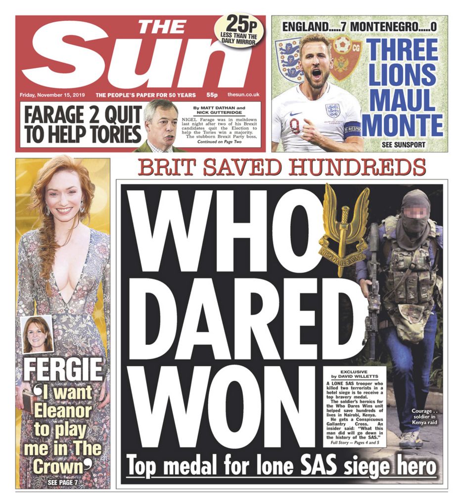 The Sun Uses very informal language such as "Three Lions Maul Monte". This is done as it appeals to the working class and gives the impression that it is like speaking to your friend. It has soft news as it focuses on football and celebrity gossip. It does have a bit of hard news as it has a bit of news of Nigel Farage. It has traditional serif masthead, in very bold writing. It also has white writing on red background. This is so the writing stands out. The headline is fully in bold, capitalized and in white on a black background. The front page is dominated by image with very little copy. This is so it appeals to lower class audience and a C2-E demographic. Most of the news are entertainment (soft news). All of the above helps the sun address a downmarket audience.
Friday, 8 November 2019
Active Advert
The advert overall is good as it appeals to the target audience of a ten year old boy who wants a body spray. It also uses different angles and frames to capture the different shots. It also uses different music to capture the correct mood. It also shows the product so the audience can remember it.
To improve the advert the shots could have been filmed as one continuous shot or in the same position as between the shots the cuts look bad as the background changes. We could also use voice over to explain the story. I also could have used different songs that go together better. I think to improve this we could have storyboard the advert better so it was better planned.
Fruitella advert
The advert is good as it matches up with the timing of the original fruitella advert. Most of the shots are the same.overall To improve the advert we need to get the missing shot of the newspaper. Also a few of the shots are not identical to the original with close up in the original advert being a longshot in ours. As well the video was filmed in lots of different rooms so sometimes the cuts looked bad as the background changed.

Subscribe to:
Posts (Atom)