Mid Market- Daily Mail
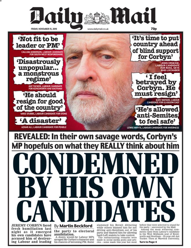
The daily mail is more formal than the popular press however it is more informal than quality press. This is because it uses slang terms such as "slammed his brexit dithering". It uses this sort of language to appeal to a wide audience but specifically the middle class. It is normally a mix of hard and soft news on the front cover, normally featuring a bit about politics, the royals and celebrities. However, on today's newspaper it is only focused on politics and hard news. It does not have traditional serif masthead for the title but instead sans serif. This is done as it makes the title stand out and give the daily mail a strong sense of identity. It also makes them look like a traditional paper from the past which would make the general public trust them. It does have a capitalized banner headline that states "condemned by his own candidates". This makes the headline stand out and appeal to the middle class audience. The front page has a high image to copy ratio which features a large picture if Jeremy Corbyn and a little bit of writing, however the difference is marginal. The paper also has its own traditional logo at the top. This logo looks like it is from the past and it would give a strong sense of nationalism to the British public. All of the above helps the daily mail appeal to a British, middle age and middle class audience.
Broadsheet- The Guardian
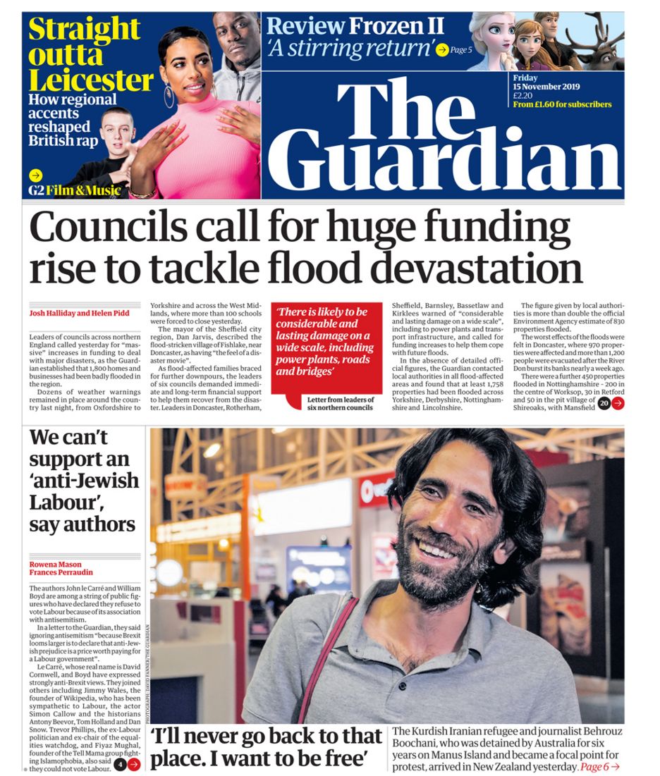 The Guardian uses formal language and no slang such as "councils call for huge funding rise to tackle flood devastation." This is so it appeals to the upper class and people from the A-B demographic. The Guardian has a largely hard news agenda as the front page focuses on the election, flooding and councils. However, there is a bit of soft news at the top as it has some film news and celebrity news. This little bit of soft news makes the guardian appeal to a wider audience. It has traditional serif masthead writing. This allows for more copy on the front page and makes it look more intelligent. This helps it appeal to the target audience. The headline is also in traditional serif masthead and capitalized as in sentence. This makes it look more formal which appeals to the demographic A-B. The front page is largely dominated by copy with very few images. The copy is also very small so that it takes most of the room. The Guardian has news as information and not entertainment, this is because it mostly focuses on hard news. This therefore offers news as information. All of the above helps the guardian appeal to an upmarket and upper class people.
Tabloid- The sun
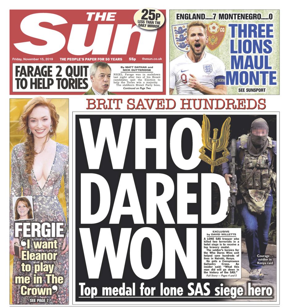 The Sun Uses very informal language such as "Three Lions Maul Monte". This is done as it appeals to the working class and gives the impression that it is like speaking to your friend. It has soft news as it focuses on football and celebrity gossip. It does have a bit of hard news as it has a bit of news of Nigel Farage. It has traditional serif masthead, in very bold writing. It also has white writing on red background. This is so the writing stands out. The headline is fully in bold, capitalized and in white on a black background. The front page is dominated by image with very little copy. This is so it appeals to lower class audience and a C2-E demographic. Most of the news are entertainment (soft news). All of the above helps the sun address a downmarket audience.
Broadsheet- The Guardian
 The Guardian uses formal language and no slang such as "councils call for huge funding rise to tackle flood devastation." This is so it appeals to the upper class and people from the A-B demographic. The Guardian has a largely hard news agenda as the front page focuses on the election, flooding and councils. However, there is a bit of soft news at the top as it has some film news and celebrity news. This little bit of soft news makes the guardian appeal to a wider audience. It has traditional serif masthead writing. This allows for more copy on the front page and makes it look more intelligent. This helps it appeal to the target audience. The headline is also in traditional serif masthead and capitalized as in sentence. This makes it look more formal which appeals to the demographic A-B. The front page is largely dominated by copy with very few images. The copy is also very small so that it takes most of the room. The Guardian has news as information and not entertainment, this is because it mostly focuses on hard news. This therefore offers news as information. All of the above helps the guardian appeal to an upmarket and upper class people.
Tabloid- The sun
 The Sun Uses very informal language such as "Three Lions Maul Monte". This is done as it appeals to the working class and gives the impression that it is like speaking to your friend. It has soft news as it focuses on football and celebrity gossip. It does have a bit of hard news as it has a bit of news of Nigel Farage. It has traditional serif masthead, in very bold writing. It also has white writing on red background. This is so the writing stands out. The headline is fully in bold, capitalized and in white on a black background. The front page is dominated by image with very little copy. This is so it appeals to lower class audience and a C2-E demographic. Most of the news are entertainment (soft news). All of the above helps the sun address a downmarket audience.
No comments:
Post a Comment